When building solutions for machine learning, it is equally important to evaluate the quality of a model
and prediction results, as well as to be able to interpret them.
Hence we created the Explainability Office, a unique set of tools that allow users to evaluate model quality at every stage, identify the logic behind the model analysis, and therefore also understand why certain predictions have been made.
Hence we created the Explainability Office, a unique set of tools that allow users to evaluate model quality at every stage, identify the logic behind the model analysis, and therefore also understand why certain predictions have been made.
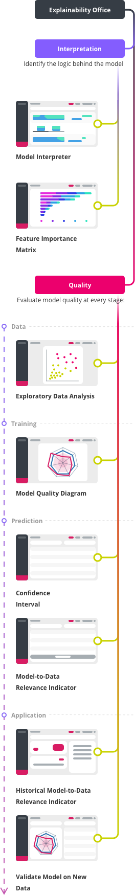
Interpretation
To comprehend the decision-making process and identify internal patterns, we simulate the output
of the model across the entire variety of input variables, and present the result in the form of
comprehensible slices of multidimensional space. At the same time, we rank these slices by
influence for each specific prediction.
Model Interpreter
The Model Interpreter is a tool that allows you to visually see the logic, direction and the
effects of changes in individual variables in the model. It also shows the importance of these
variables in relation to the target variable.
Read more
Feature Importance Matrix (FIM)
After the model has been trained, the platform displays a chart with the 10 features that had
the most significant impact on the model prediction power. You can also select any other
features to see their importance. FIM also has 2 modes, displaying either only the original
features or the features after feature engineering. For classification tasks you can see the
feature importance for every class.
Quality
Evaluate model quality at every stage:
Model Lifecycle: data
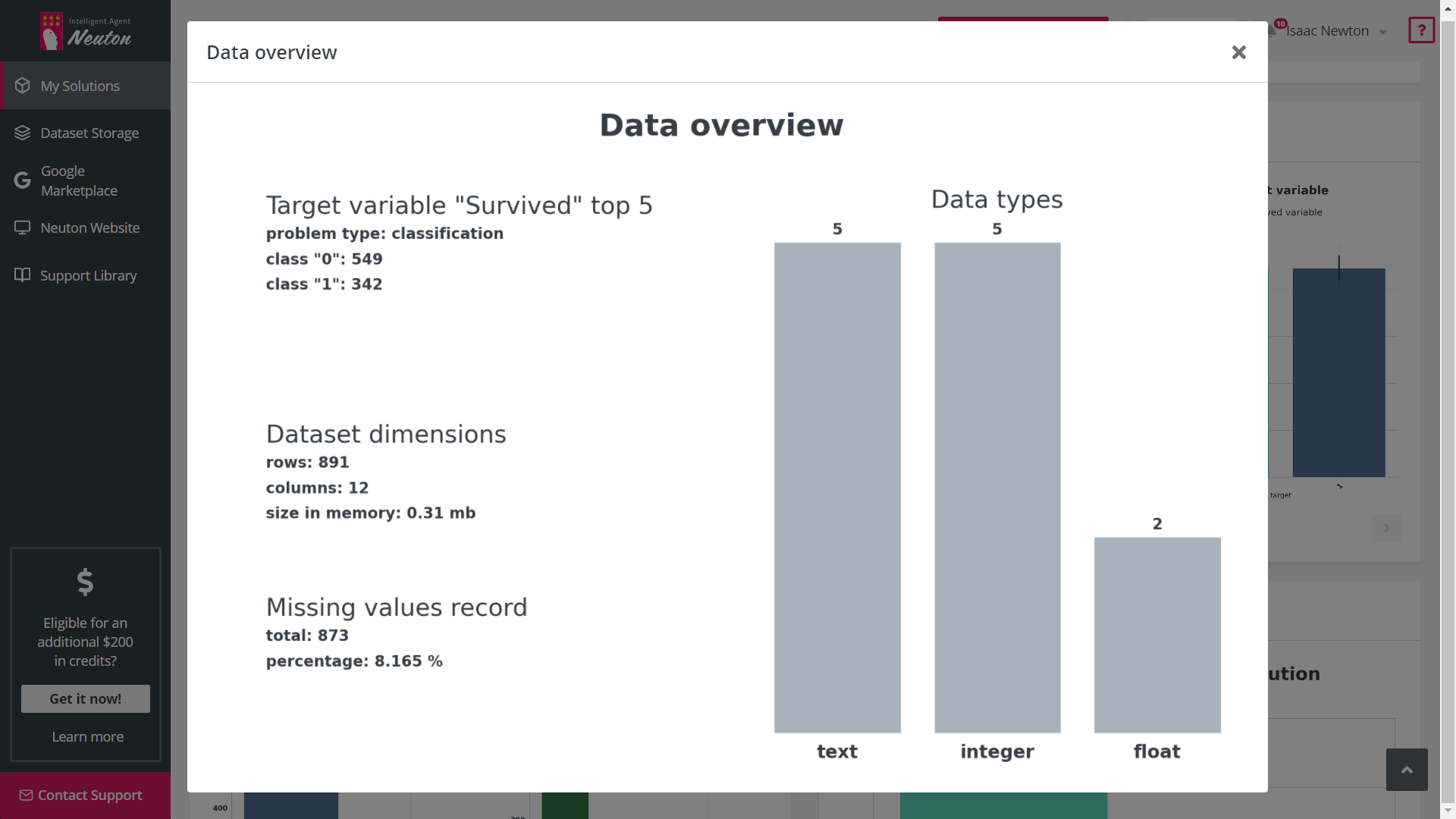
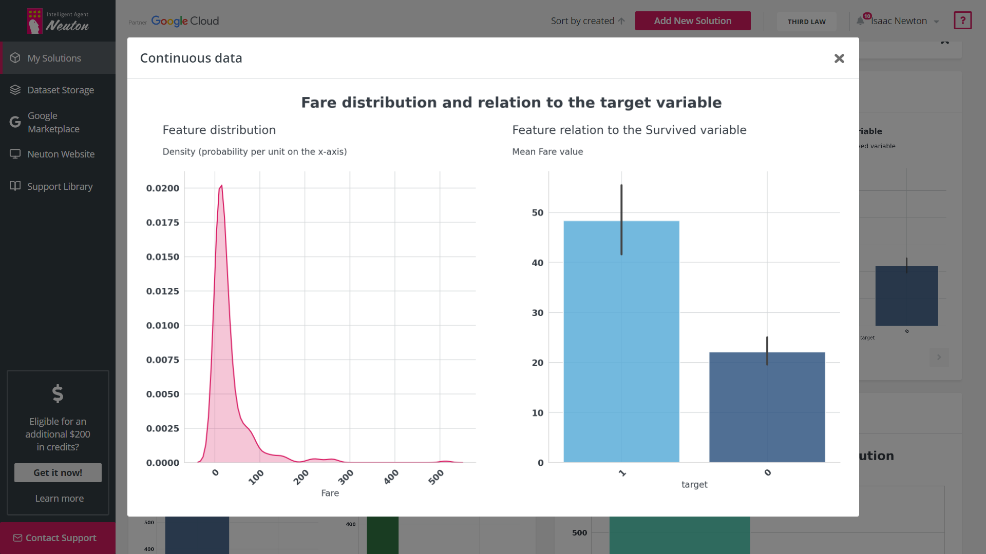
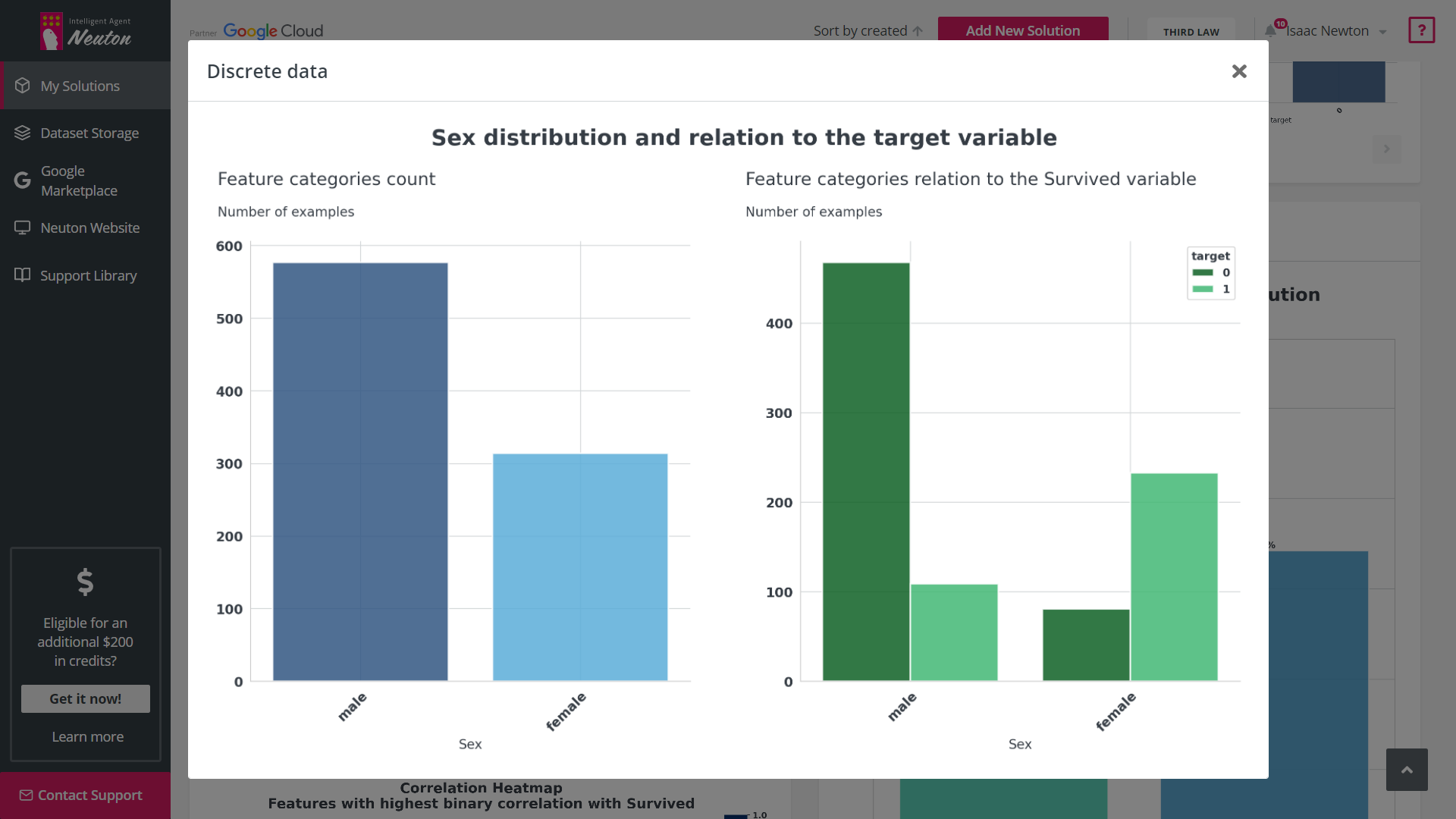
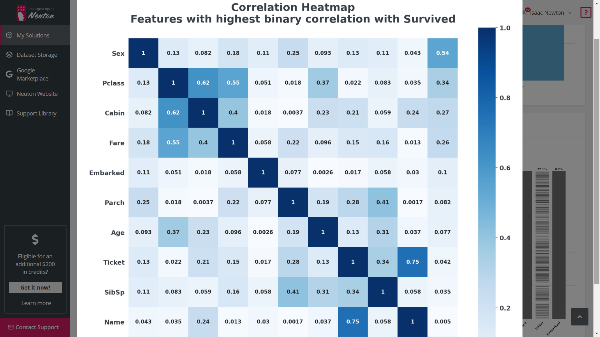
Exploratory Data Analysis (EDA)
Exploratory Data Analysis (EDA) is a tool that automates graphical data analysis and highlights
the most important statistics in the context of a single variable, overall data,
interconnections, and in relation to the target variable in a training dataset. Given the
potentially wide feature space, up to 20 of the most important features with the highest
statistical significance are selected for EDA based on machine learning modeling.
Read more
Model Lifecycle: Training
Model Quality Diagram
Model Quality Diagram simplifies the process of evaluating the quality of the model, and also
allows users to look at the model from the perspective of various metrics simultaneously in a
single graphical view. We offer an extensive list of metrics describing the quality popular in
the data science community.
Model Lifecycle: Prediction
Besides well-known indicators for evaluation of model quality (e.g. probability and credibility
interval), we also calculate a set of additional indicators (row-level explainability):
Confidence Interval
The Confidence Interval, for regression problems, shows in what range the predicted value can
change and with what probability.
Model-to-Data Relevance Indicator
Model-to-data Relevance Indicator calculates the statistical differences between the data
uploaded for predictions and the data used for model training. Significant differences in the
data may indicate metric decay (model prediction quality degradation).
Model Lifecycle: APPLICATION
Historical Model-to-Data Relevance Indicator
Historical Model-to-data Relevance is an excellent signal for models to retrain. This indicator
is designed even for downloadable models, which allows to manage a model lifecycle even outside
the platform.
COMING SOON
Validate Model on New Data
Validate Model on New Data shows model metrics on new data to help determine whether the model
should be retrained to reflect the statistical changes and dependencies in new data. It also
shows metrics in multidimensional space (Model Quality Diagram).